42 facts
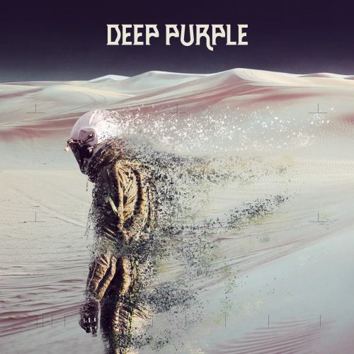
Speaking of Planet Rock, they also have a collection of semi-random factoids titled 42 facts about Deep Purple’s album covers — that’s two for each studio album. As we all know, 42 is also the answer to the ultimate questions of life, the universe, and everything. To top it off, truly yours website gets a namecheck. Apparently this collection is a part of their Deep Purple month celebrations that should last throughout September.
From the incredible sleeves of ‘Deep Purple In Rock’ and ‘Whoosh!’ through to the downright bizarre artwork of ‘Bananas’ and ‘Purpendicular’, take a look at all the Deep Purple album cover facts below.
Check it out on planetradio.co.uk
![[hand]](/hs-pics/portraits/hands/gillan2.jpg)
![[face]](/hs-pics/portraits/faces/mcbride2.jpg)


 Unauthorized copying, while sometimes necessary, is never as good as the real thing
Perfect Strangers is the last good artwork..
September 11th, 2020 at 20:56Then sadness.
What’s strinking me the most is that they re-invented logo and font literally every time.
Most memorably maybe the “Deep Purple” lettering of Stormbringer, The Battle Rages On, Purpendicular and more recently Now What and Infinite as well – and of course the Perfect Strangers DP logo, which was for once used on the following albums too to a degree.
But not really a continuity as you would maybe expect from such a long career. Like many bands have.
So indeed a clever nod to let the Whoosh font resemble the first album! Didn’t notice that myself.
September 12th, 2020 at 14:09They show a cover of the Pearls for Swine cover without mentioning that that was an other band with also the idea of using the work of Hieronymus Bosch.
https://en.wikipedia.org/wiki/One_Nation_Underground_(Pearls_Before_Swine_album)
September 12th, 2020 at 16:29Great article.
September 12th, 2020 at 23:50Meh.
September 13th, 2020 at 21:19